Case Study
Further Learning Student Assignment Process
Further Learning is a web-based learning management system (LMS) which easily allows course administrators to create and manage accredited courses, and offers students an engaging platform to learn, undertake assignments and communicate with their peers & expert tutors.
As Product Designer, it was my responsibility to set a strategy and product roadmap and to design and deliver an experience which catered for the needs of both course administrators and students.
This case study focuses on the the first task I undertook to improve the experience for the students and offers an insight into my approach when designing features. This overview article outlines an extensive list of all of the projects and features I was tasked with.
Problem
When I joined the team at Further Learning, they had a student area which was closer to a functional proof of concept than a fully fledged online learning platform. It fulfilled the basic requirements for students where they could download assignment briefs, upload submissions and communicate with staff and peers through a forum. The experience was rigid and difficult to use and the structure had little or no potential for scaling up and adding features that were in the pipeline.
While enrolment numbers were rapidly increasing, there was poor engagement, a low graduation rate and high amount of refund requests. Ultimately the student area reflected poorly on the excellent education offered and the support team at Further Learning.
These interviews allowed me to gain a full spectrum of the challenges that each individual had faced with the previous website and also to obtain a list of the goals for the new site from a user facing point of view and also from an administrative point of view.
Vision
Many of the issues our students were experiencing are not just the result of failings in our online learning platform. They were larger issues faced by students when taking online courses in general, and ones which I identified as being best tackled not just by looking at the limitations of our platform, but by applying design thinking methodologies to the whole process.
By defining and framing the problems from the perspective of our students, we could better understand their motivations, goals and the challenges they faced in completing online courses, within the context of their lives.
We hypothesised that we could increase student progression, by focussing our efforts around four core values that were central to student development: Education (content), Peer learning, Mentoring & Engagement.
User & Audience
Further Learning currently operate in 5 different subject academies across Ireland, the UK, the US and Australia where they offer blended learning and they have a global reach for their online courses. Our students have different education levels, range in age from 18 to 65 and come from different backgrounds with varying levels of computer and technological literacy.
I carried out user research to understand the motivations and goals of a wide range of our students. Some are hobby based, while others are looking for a career change or to level up. Identifying and solving for standard task flows across these different user groups, and always with an emphasis on accessibility, was one of the most challenging aspects of designing features for the platform.
Team & Stakeholders
Leadership
I met regularly with our cross-functional team with representation from product, engineering, academics, customer support and sales. I relied on this group for reaching alignment on our goals and success criteria, getting feedback on critical features, and sharing the impact of the designs on user behaviour. At an oversight level, I also had to gain alignment from our CEO and CTO on the product direction. I presented my designs regularly to the wider team before the work was handed to our Product Engineers for development.
Product Team
I worked in a small product team, consisting of a Product Manager, two Engineers, and myself as the Product Designer. This was a very agile process in which some level of research and prioritisation was conducted initially, with the majority of the discovery, research, and design occurring during each phase. As features were delivered, we integrated them into the overall product, tested our hypotheses, and then made changes accordingly.
Users: Course Administrators & Students
I was also working with course directors, course administrators and students that used the online learning platform. This served as a way to validate our decisions and get more feedback on what was or wasn't working in their current workflow.
Constraints
- Small team building multiple projects under a tight timeline
- Building on top of a legacy system with a large existing user base
- Finding a balance between implementing student feedback and adhering to accreditation guidelines
Design Process
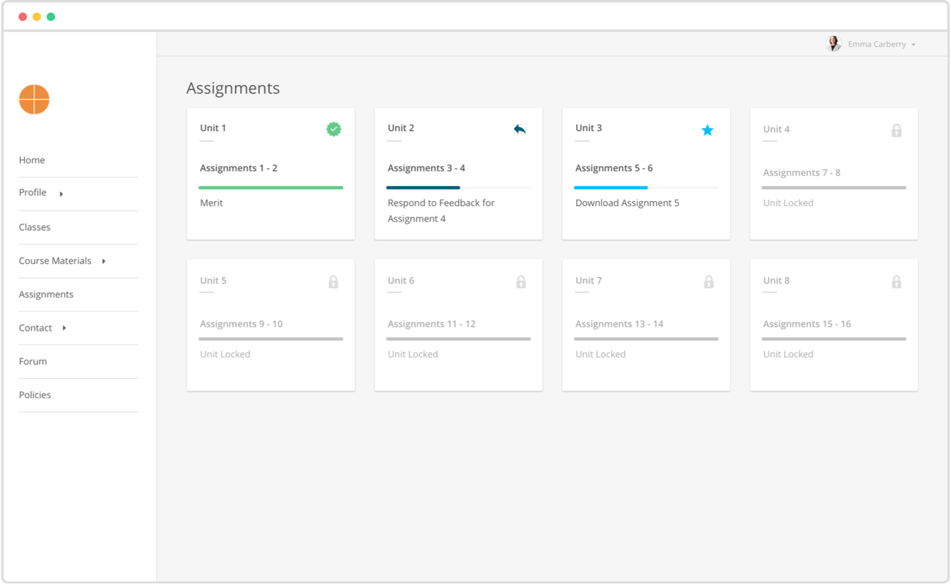
Better Assignments: Overall engagement and progress monitoring, briefs, submissions & feedback
Having carried out my own field research undertaking a series of online courses, I identified the overall assignment process as being most important to tackle first in order to deliver on our goal of improving student progression.
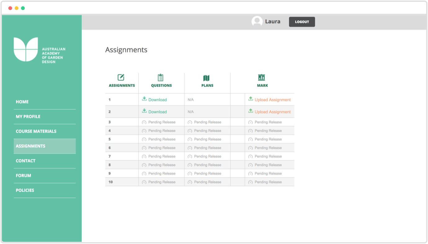
I evaluated the initial assignment flow for students. The UI consisted of a table which allowed students to download assignment briefs, upload completed assignments and download feedback. This UI was limited and created a lot confusion for students through the many edge cases that would arise.
To account for this, the product team and management team met to set out a list of requirements for the new UI to ensure all edge cases, potential flows and scenarios were handled properly.
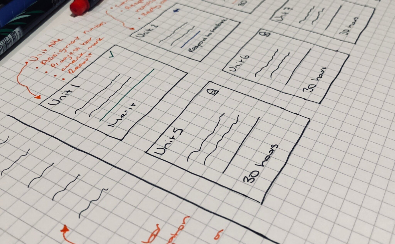
To design the user experience around these requirements, I sketched out the various assignment screens and interactions and I set out a list of additional guidelines that I felt would improve the experience for students.
This process enabled me to design a flow which would answered our students most common ongoing questions:
- what assignments have I completed?
- what assignments do I need to do next?
- how long will this unit take to complete?
- what assignments have I received feedback on that I need to review?
- where am I in regards to my progress within each unit and the overall course?
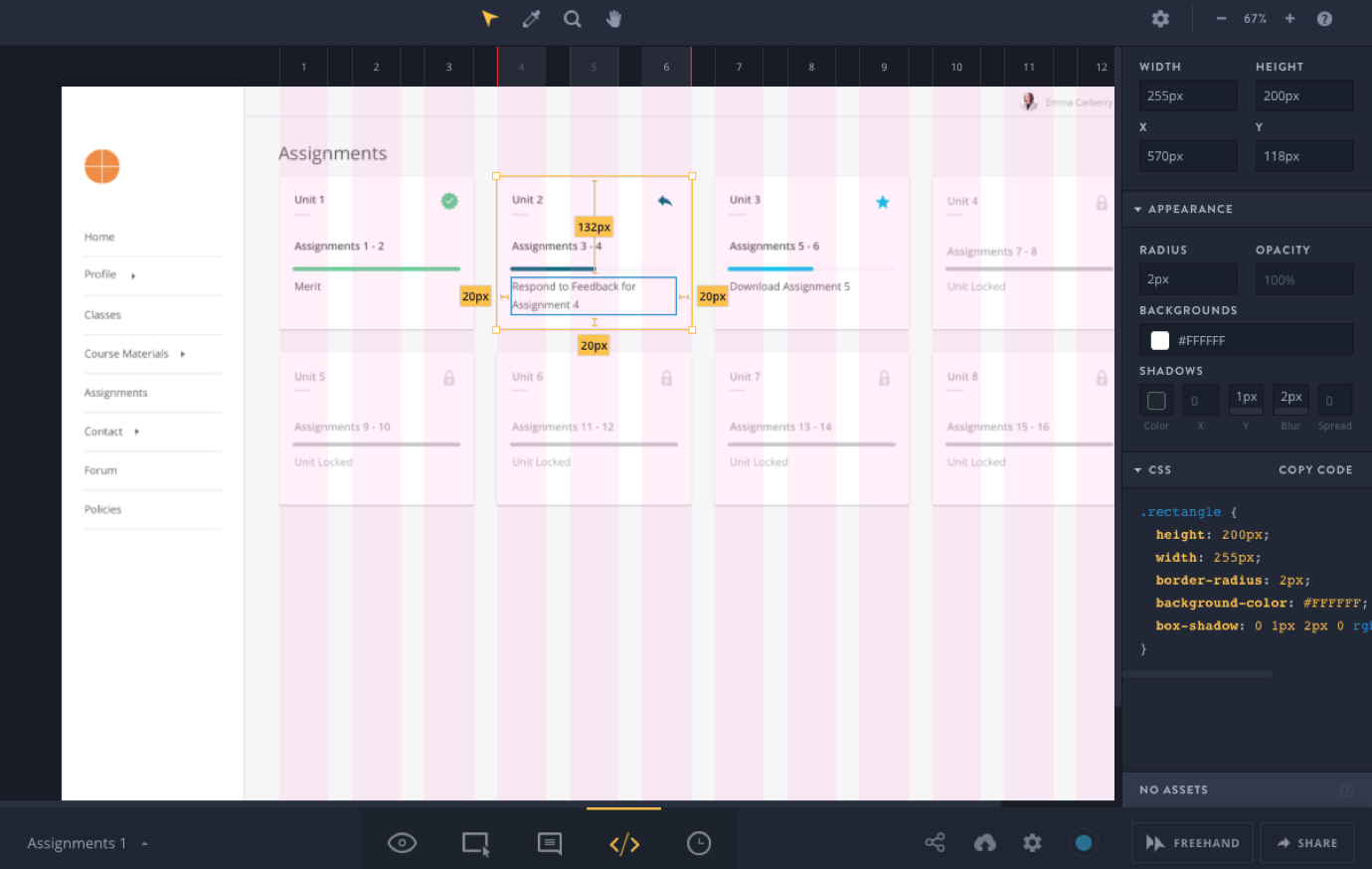
A combination of paper mocks and role playing helped me iterate over the user experience quickly and solve for the edge cases. I then moved onto creating high-fidelity mockups in Sketch, and translated to interactive prototypes with InVision. At the end of each phase, I would demo the progress to a selection of students, course administrators and our management team to uncover any issues in the user experience.
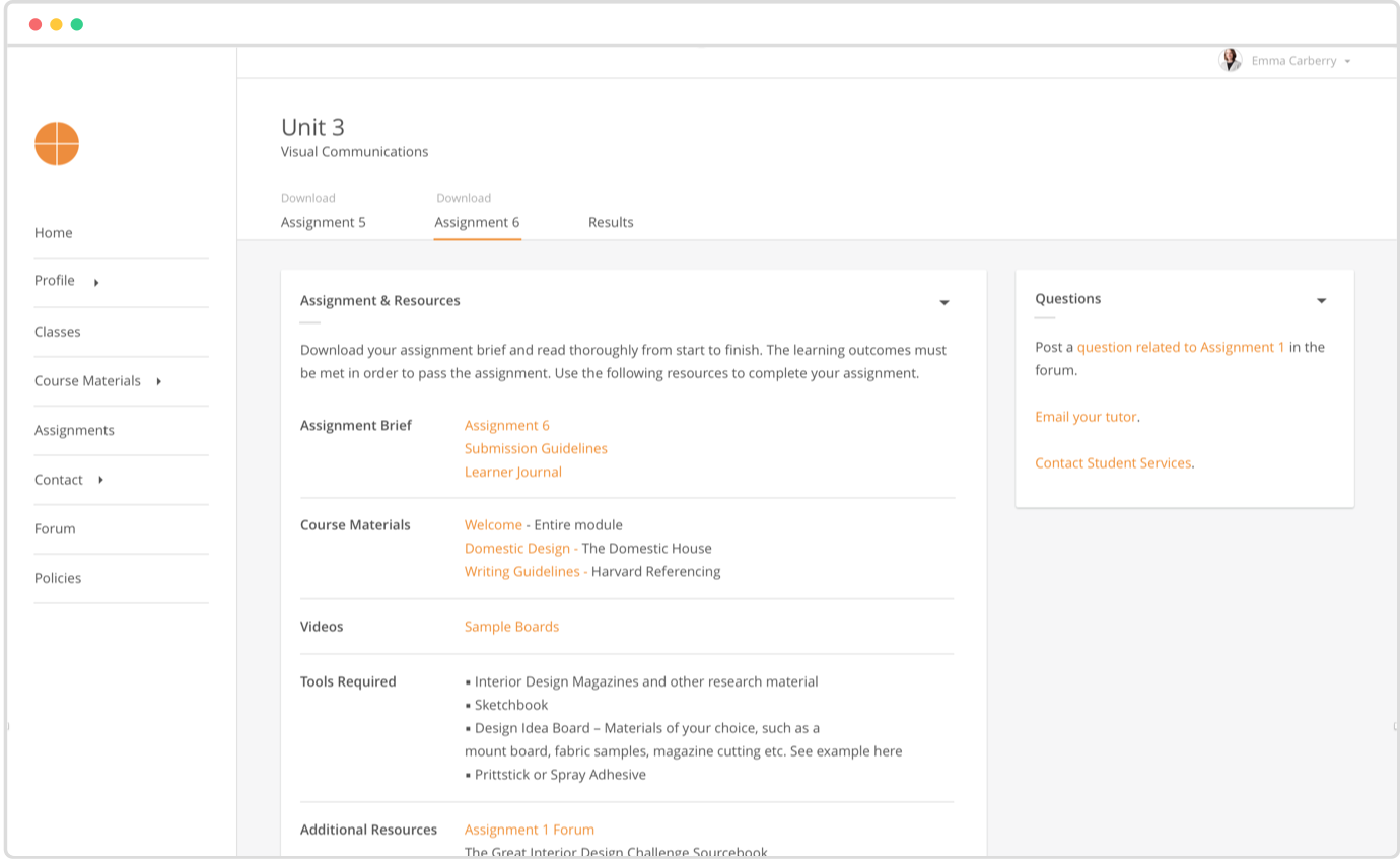
All these improvements, combined to deliver an experience which offered students considerably more clarity around all aspects of their course progression.
Visual Design
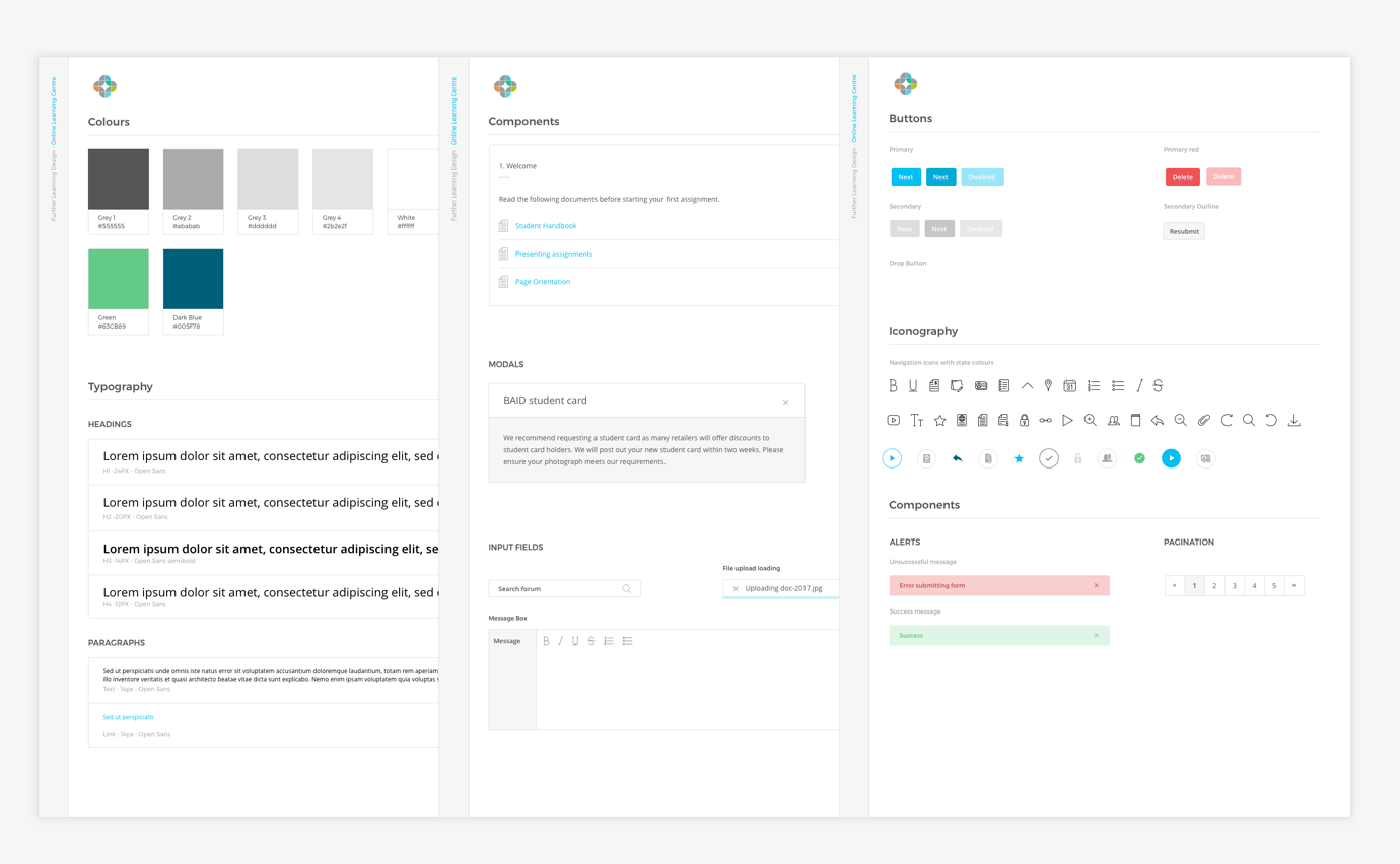
Brand Guidelines, Design System
In parallel with the UX and design of the user area, I was also leading the UI and visual design for the product as a whole, which included:
- Creating a set of reusable components
- Choosing icons for all aspects of the product
- Using the brand typography
- Reusing Further Learning colours when possible to create a consistent experience, but adding to that scheme for readability of data
Once detailed high-fidelity specs were completed, I would import them into Invision for our developer to use. Often times, I would add contextual comments to communicate expected behaviour. Doing so was a cost-effective and simple way to communicate designs, provide design assets, and build out design specifications.
The Result
The online learning platform is now better supporting our students and allowing them to work more independently as well as offering more resources and guidance for them when they do need help.
Retrospective
Investing in user research
While we were able to carry out a certain amount of research with some of our current students, it is something we need to do a lot more of, to uncover more problems and solutions our students may be having, and also to offer possibilities for solutions we haven’t yet considered.
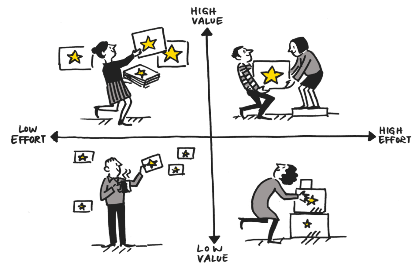
Reducing scope within phases
Project scopes can escalate and become to large for the resources we have available. By using a prioritisation matrix we can investigate which features will offer the greatest value for the least amount of time/effort. Additional features can then be added to the road map in a phased approach.
Thanks for reading!
Thanks for taking the time to read through my case study! If you’d like to discuss any aspect of this project, or any other project for that matter, please don’t hesitate to contact me.