Product Showcase
Designing the new Further Learning Experience
Further Learning is a web-based learning management system (LMS) which easily allows course administrators to create and manage accredited courses, and offers students an engaging platform to learn, undertake assignments and communicate with their peers & expert tutors.
As Product Designer, it was my responsibility to set a strategy and product roadmap and to design and deliver an experience which catered for the needs of both course administrators and students.
This showcase provides an overview of some of the projects I undertook to create an experience in which both student and staff can carry out their tasks efficiently. This case study focuses on the first task I undertook to improve the experience for the students and outlines the typical approach I take with the team when tackling problems.
Designing the Online Learning Platform
1. Getting Started Guide
A key consideration in the usability of the online learning platform was the initial setup process. We had a requirement that each student upload specific documents before they could begin assignments so it was vital that every student could complete these steps as quickly as possible.
I designed a flow for a setup guide with broken down easy to follow steps. The students could see exactly what would be required before beginning, how long it would take and where they were along the way at all times. For each step, I provided well explained instructions. Initial testing and results showed this layout to be a very favourable approach. I then iterated on the copy to create clear and concise instructions that provided clarity around the aspects which had caused any confusion in testing.
2. User profiles
Support staff were inundated with admin requests from students looking to update their personal information, request information regarding payments and to upgrade their courses. I identified this to be one of the first features to provide a “quick win” as it was a particular pain point on both sides of the spectrum.
Students are now able to update personal information, review and make top up payments and upgrade courses within the online learning platform.
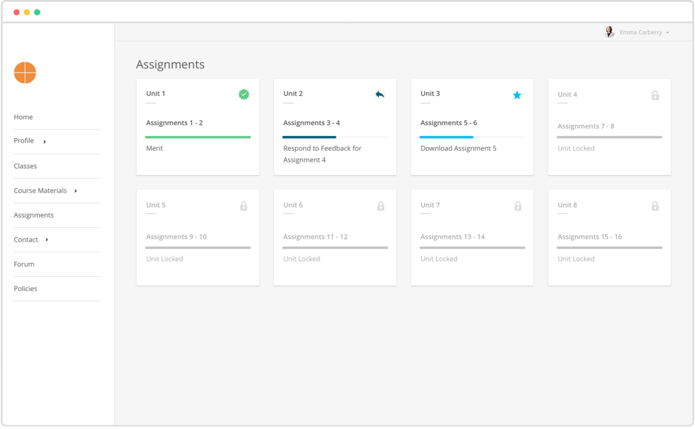
3. Assignment Process
I created an assignments process which allows students to track their progress and assignment requirements through a user friendly dashboard.
Read more about my process designing this feature here.
Designing the Learning Management System
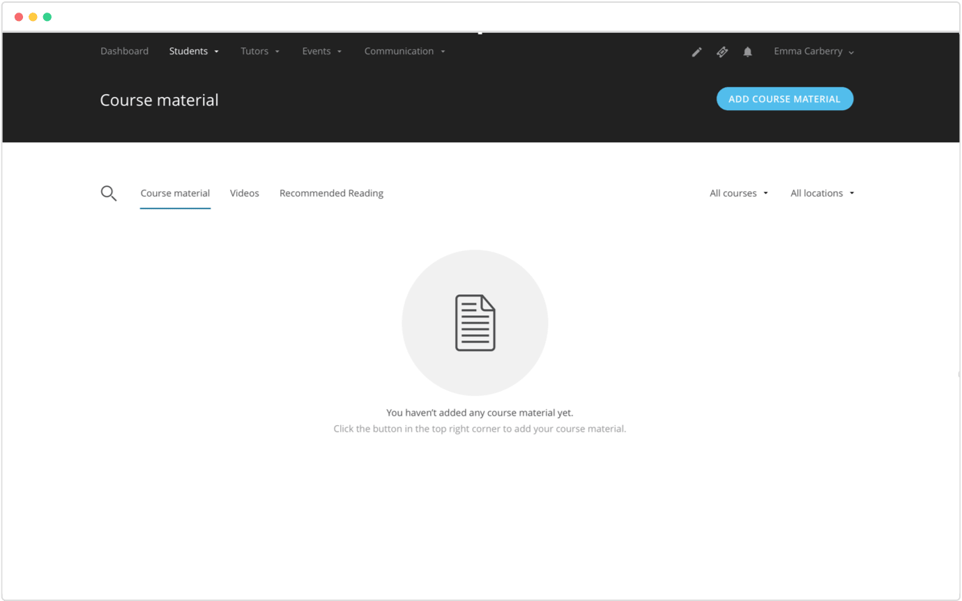
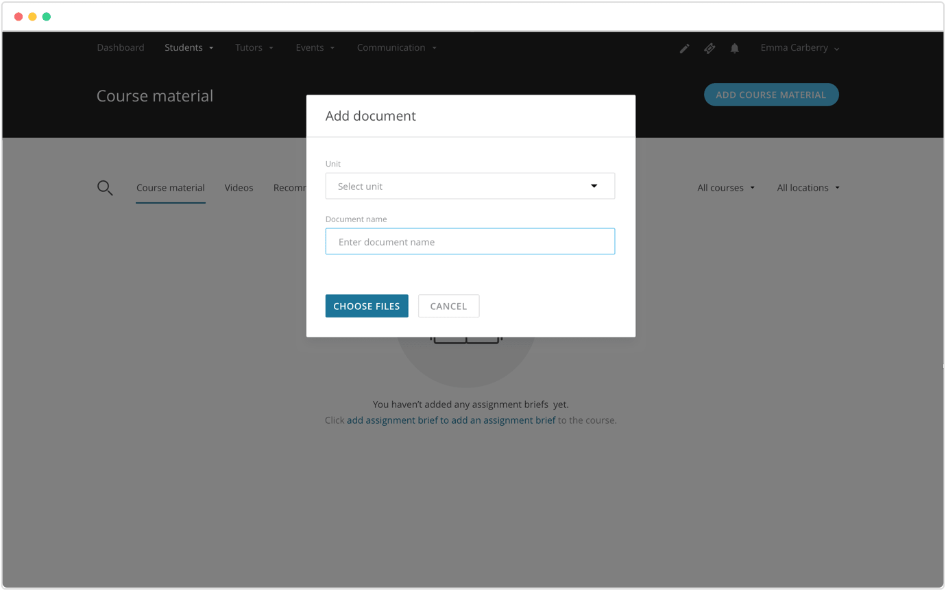
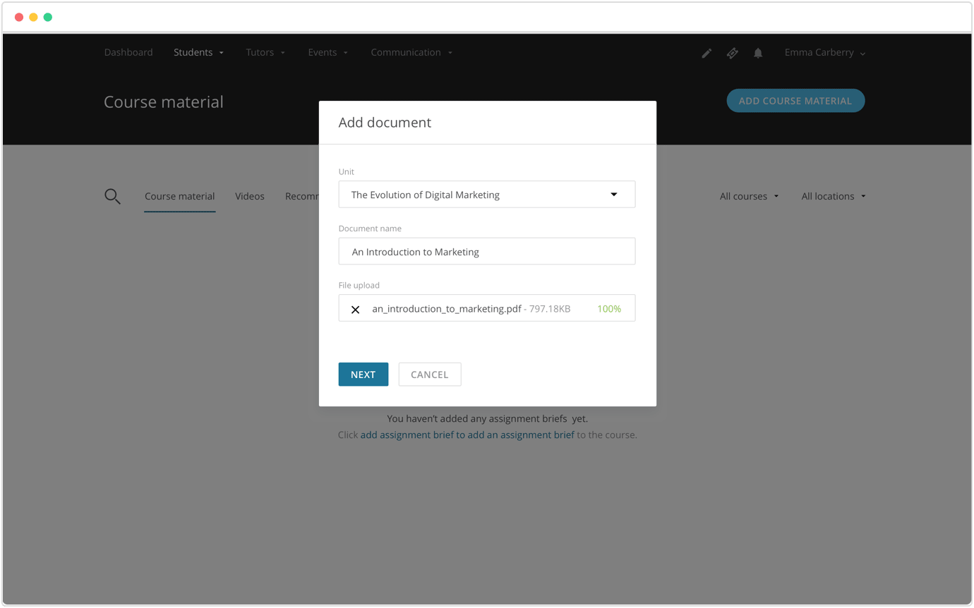
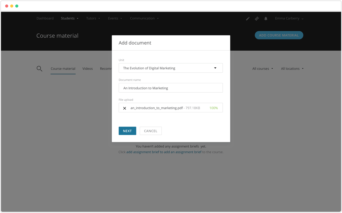
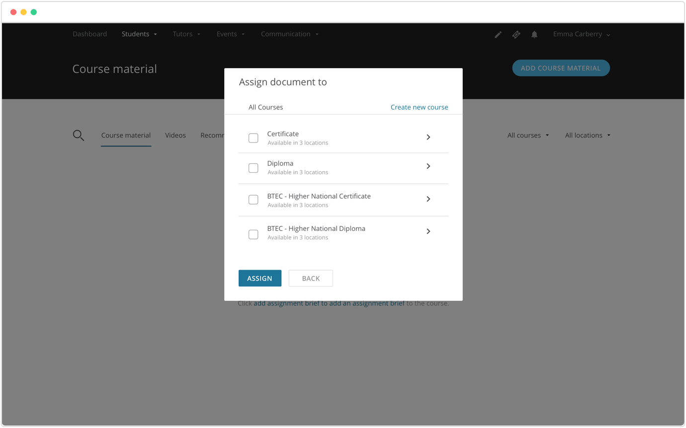
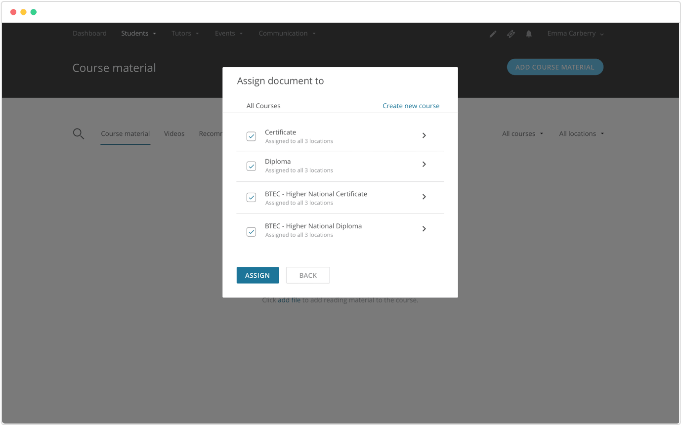
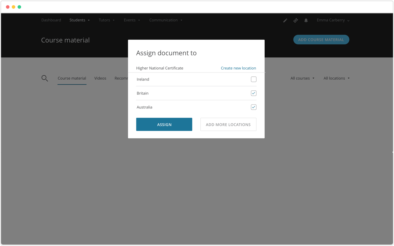
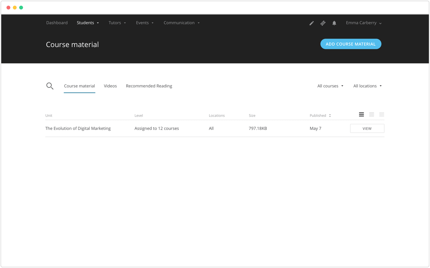
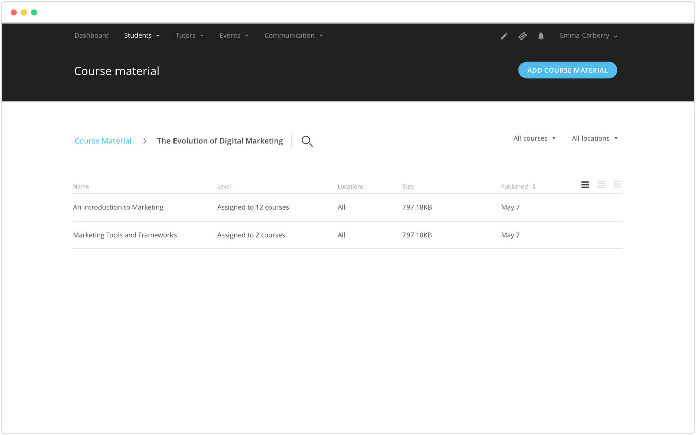
1. Versioned content and assignment builder
Course administrators are able to create, assign, edit, review and publish course material and assignments which can be versioned and easily monitored for different cohorts.
2. Manage tutors
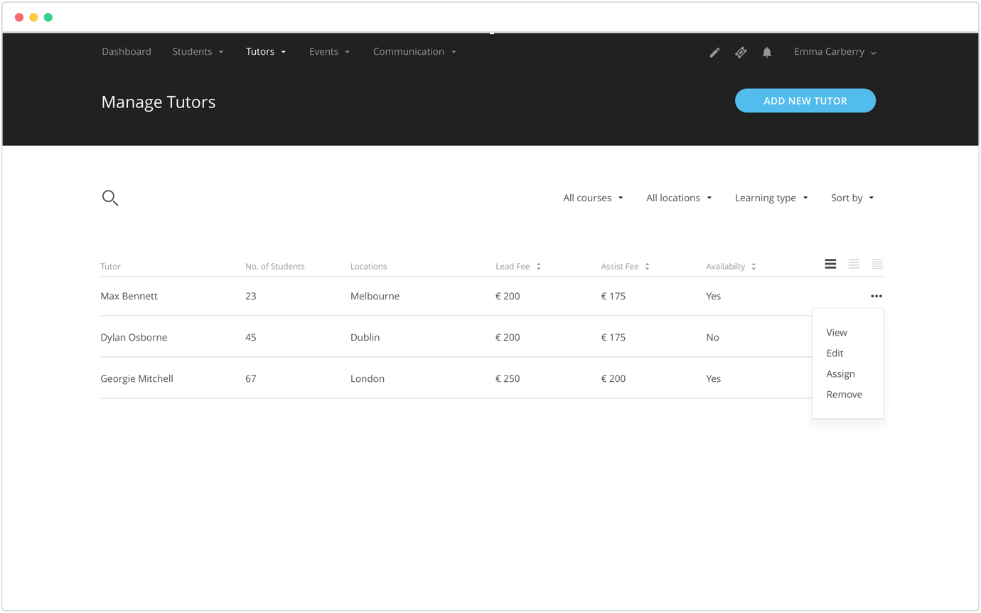
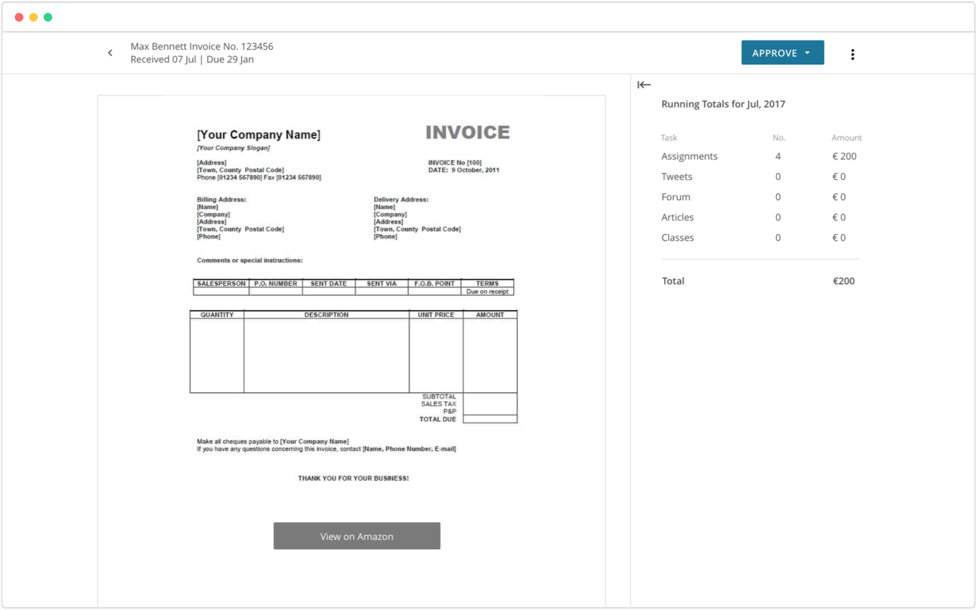
Course administrators are able to add new tutors to the LMS and assign them to students based on their availability. Course administrators are able to reconcile the workload taken on by tutors and approve their monthly invoices accordingly.
3. Assignment marking feature
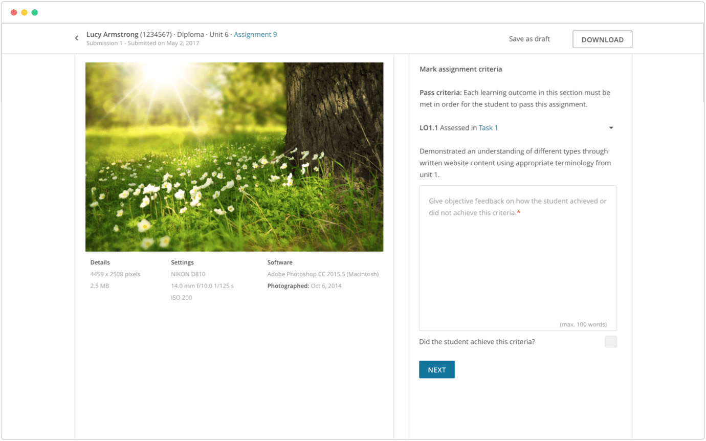
I created an assignment marking feature which allows tutors to view the assignment within the LMS and to provide concise feedback for students based on specific assignment criteria.
4. Task management feature
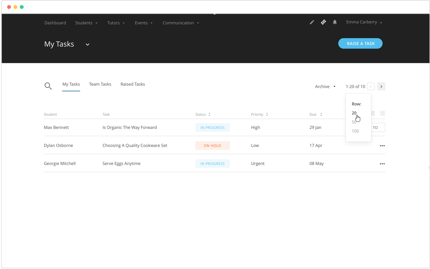
I created a task management feature within our LSM. This feature integrates into the call collaboration tool allowing our support team to easily set tasks for our students and alert relevant team members in a few simple clicks.
5. Integrated international voice calls
In the last year Further Learning has launched two new academies and expanded across 3 continents. I conducted several interviews with our staff to better understand their current work flows when they are engaging with students worldwide across the variety of academies and their issues with it.
Goals and Objectives
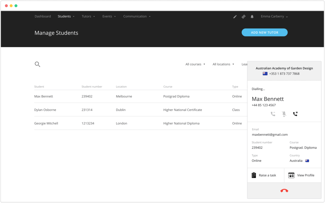
- View caller’s name
- Ability to put call on hold
- Ability to forward the call to another staff member
- Ability to mute call
- Distinguish which Academy the student is enrolled in
- Distinguish which Country the student is calling from
- Review student’s profile immediately to maintain a personal rapport
- Set a task for the student
The solution was to design a call collaboration tool which makes international voice calls and integrates seamlessly with our student/lead database.
6. The Further Learning Marketing Site
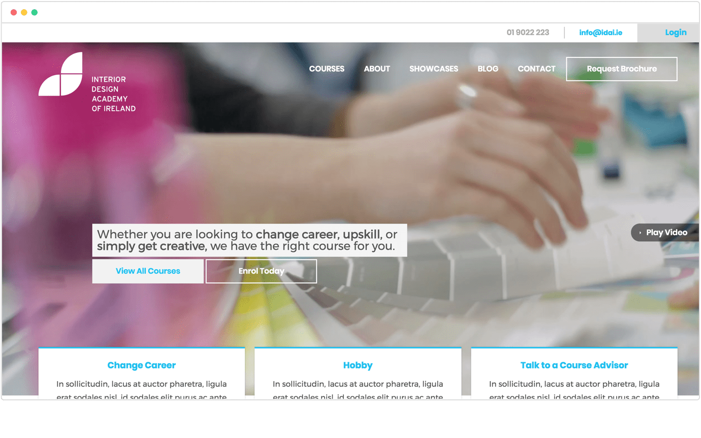
Further Learning have been collaborating with the creative agency, Zoo to design a suite of new marketing sites for our academies. I have been heavily involved throughout the research, design and bug testing stages of the project providing feedback and reviewing iterations. This project is work in progress.
Thanks for reading!
Thanks for taking the time to read about my work at Further Learning! If you’d like to take a look at a case study which provides more detail and insight into my design process click here.